Romantic Era Blog
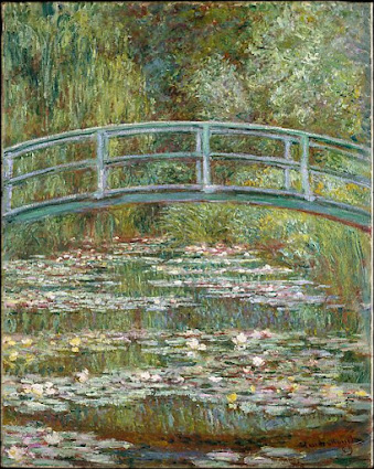
Bridge over a Pond of Water Lilies. Claude Monet, 1899
The Bridge at Villeneuve-la-Garenne. Alfred Sisley, 1872
Both of these artworks are impressionist styles. I love the way that both of these paintings look. They both are very bright, using lighter colors and blending them together well to create a warmth effect. They're very welcoming and inviting to look at, with no super harsh lines or colors. Both of these paintings are beautiful, and out of the two I would rather have the first one in my home, it would go with a lot more than the other painting.
Grandcamp, Evening, oil on canvas by Georges Seurat, 1885.
The Mont Sainte-Victoire by Paul Cezanne, 1904.
Both of these are post-impressionism artwork styles. I liked these two less than I liked the two before. These ones feel duller, with darker colors and more shadows. It also feels like they have less distinct features, with the lines seeming to just blend into one another. This style is not as appealing for me to look at as the other one is. I would not own either of these for my own household.
I think they were going for a more realistic look, all throughout the artwork I have covered, some of it is just more defined than others. They all show a landscape of some kind, whether it be up close or further away. When I used to draw (or try to, at least) realistic pictures, I often struggled with the details so I did a lot of blending things together to create a more blurred effect like the last painting has.
British, Alfred Sisley. “Alfred Sisley: The Bridge at Villeneuve-La-Garenne.” The Metropolitan Museum of Art, 1 Jan. 1872, www.metmuseum.org/art/collection/search/437680.
French, Claude Monet. “Claude Monet: Bridge over a Pond of Water Lilies.” The Metropolitan Museum of Art, 1 Jan. 1899, www.metmuseum.org/art/collection/search/437127.


I also picked Monte’s painting. Mine is a little different but I like how they aren’t the same. My favorite one you talk about is the one by Cézanne. It almost reminds me of “ the Scream”. Grandcamp reminds me of stippling how it’s painted.
ReplyDelete